Advanced Data Analysis
Predictive modeling
Predictive modeling involves working out how one set of variables predicts another variable. There are two ‘flavors’ of this type of analysis that are commonplace: driver analysis and targeting.
Driver analysis
Driver analysis seeks to work out the relative role that different drivers of preference play in a market. For example, if there is one question that measures overall satisfaction and another question which measures satisfaction with different areas of a company (e.g., customer service, price, quality), then driver analysis can be used to quantify the relative impact of each of the overall areas on overall preference. Driver analysis is usually conducted using Regression. Choice Modeling is a type of driver analysis.
Regression
Regression is a statistical tool for quantifying a model. The key output of regression is a formula, such as:
$Sales = $121 + 4.1 × $TV Advertising Expenditure + 3.2 × $Online Advertising Expenditure
With such a formula it is possible to:
- Make predictions. For example, using the formula above, a firm that spends $1,000,000 on TV advertising and nothing on advertising expenditure is predicted to have sales of $121 + 4.1 × $1,000,000 = $4,100,121.
- Draw conclusions about relative effectiveness. For example, the equation above shows that TV advertising is more effective than online advertising.
Most regression models are characterized by having one dependent variable and one or more independent variables.
In the example above the dependent variable is sales. Common dependent variables in survey analysis applications of regression include:
- Overall satisfaction with a product or a service.
- Likelihood to recommend a product or service.
- Net Promoter Score.
- Likelihood to use a product or service again.
- Product quality.
- Frequency of buying or using a product or service.
The independent variables will typically be a list of variables that are believed to determine the value of the dependent variable. In the example above, the independent variables are $TV Advertising Expenditure$Online Advertising Expenditure</tt>. In most applications of regression to survey analysis, the independent variables are either:
- Demographic variables. For example, if wishing to identify high value customers, the dependent variable may be amount of money spent and the independent variables would be demographics.
- Measurements of performance in different areas. For example, if the dependent variable measures satisfaction with an airline the independent variables could be things such as satisfaction with the food, satisfaction with the cabin crew, satisfaction with the in-flight entertainment, and so on. Such a regression model is known as a driver analysis.
- Measurements of effort in different areas. For example, expenditures on different types of advertising, such as in the above example.
Targeting
Targeting, which seeks to identify the distinguishing characteristics of a group of people of particular interest (e.g., if wanting to understand the demographic profile of the heaviest users of a service). There are many dozens of techniques in widespread use for targeting. However, most of these techniques are very complicated and easy to misinterpret. The only one of these tools that can readily be used by non-statisticians is Predictive Trees.
Predictive Trees
Example
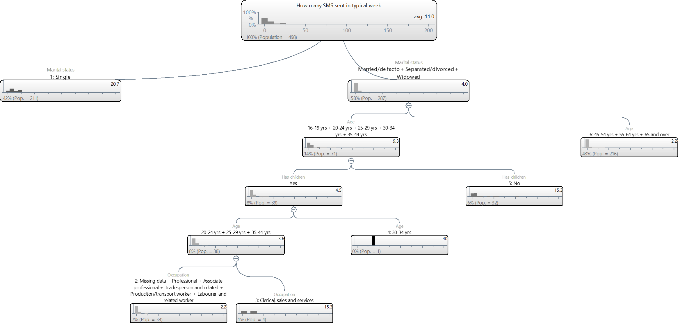
The tree below predicts the number of SMS of people in the Mobiles example study. The top box on the tree shows the data for the entire sample (i.e., 100%). It shows an average of 11.0 text messages per person and the histogram (column chart) shows that the most common answer is around 0. From this tree we can see that the first predictor variable is Marital status: people that are Single sent an average of 20.7 SMSs, compared to 4.0 among the non-single people.
As the Single category is not split further this tells us that once we know that somebody is single then we can make a prediction without any further information, where the prediction is that a single person will make 20.7 SMS. From the histogram we can see that there is still considerable variation among these single people.
Looking now at the people that are not single (i.e., Married/de facto + Separated/Divorced + Widowed), this group is split by age and we can see that people that are Married/de facto + Separated/Divorced + Widowed and are aged under 45 have an average number of SMS per month of 9.3, compared to 2.2 among those that are aged 45 or more and are Married/de facto + Separated/Divorced + Widowed.
Looking further down the tree we can see that this younger group is split further by whether or not they have children, age again and occupation.
Viewing the tree as a table
The tree above can also be expressed as an (admittedly ugly) table:
The strengths and weaknesses of predictive trees
The key strength of predictive trees is ease-of-use. Provided that you apply a bit of commonsense and take the time to learn how to use the software that you are using, it is hard to go particularly wrong with a tree. Predictive trees are the closest thing that there is to an idiot-proof advanced analysis technique. By contrast, regression, which can be used for similar problems, is frequently used incorrectly by very experienced researchers.
The major limitations of predictive trees are that:
- They are at their best with very large sample sizes. Predictive trees with less than a few hundred observations are often not useful. This is because each time the tree splits the sample size also splits, so with small sample sizes the trees end up having only one or two variables.
- Predictive trees cannot be used to make conclusions about which variables are strong and which are weak predictors. For example, looking at the Single group a natural, but incorrect, interpretation is that age is irrelevant because it is not used to split this group further. However, such an interpretation is not correct because it ignores that being single is correlated with being young. To appreciate this, we can exclude marital status and re-grow the tree. The revised tree is shown below. Note that now Age is shown to be the first predictor of number of SMS per week and it seems to be close to be similar in its predictive accuracy to marital status, with predictions ranging from 2.8 to 22.3, compared to from 4.0 to 20.7 for marital status.[note 1]
Software
Most advanced statistical techniques are reasonably standard, with different programs providing basically the same outputs. This is not the case with predictive trees. Most software companies create their trees in different ways and the distinctions between the trees created by different programs can be large.
All of the common predictive tree programs are technically described as being recursive divisive algorithms, which is a fancy way of saying that they:
- Find the variable that best predicts what is being predicted.
- Split the sample into groups that are relatively similar in terms of this variable (e.g., in the tree at the top of this page, the groups were defined based on marital status).
- For each of the new groups, repeat steps 1 and 2, continually splitting each group and further splitting until no more splitting is practical. (In computer science and logic the idea of continually reapplying the same process is called recursion).
The key differences between the different bits of software are:
- What they can predict. Most programs will only predict a single categorical or a single numeric variable. The major exception to this is Q, which can simultaneously predict multiple numeric, categorical and other exotic data types (e.g., Choice Modeling data).
- How many groups they form each time they do a split. In the examples above, the program (in this case Q), tries to optimally work out the number of groups at each level of the tree. A similar approach is used by SPSS’s Tree, AnswerTree, CHAID and Displayr. The alternative approach is to always split into two groups; this approach is used in CART.
- What rules they use to determine when to stop further splitting groups in the tree. Each of the programs has various ways of doing this, including:
- Requiring that additional splits improve the predictive accuracy of the tree (different programs implement in this in different ways; CHAID uses significance tests, Displayr and Q use information criteria and CART usually uses cross-validation).
- Specifying a minimum sample size after which a group cannot be further split.
- Specifying a maximum number of levels of the tree.
- The number of options available. Displayr, for example, only lets the user choose between a small and a bigger tree, SPSS’s tree let’s the user choose between various tree algorithms (e.g., different variants of CHAID and CART), R’s rpart can be customized in pretty much any way that is desired if the user is skilled enough and Qlets the user change the predictor variables available within each group.
Notes
- Jump up↑ Indeed, it may look that age is a better predictor, as it has a larger range. However, in this case occupation is preferred because it has a fewer number of categories with broadly similar predictive accuracy; this is an example of the principle of parsimony being taken into account when creating a model.
Segmentation
Segmentation involves finding groups of people that have given similar responses in a survey with the goal being that similar strategies can be developed for each of the segments of similar people. For example, if a study has been conducted looking at the type of leisure activities that people undertake then segmentation will identify groups of people that undertake similar types of leisure activities. There are three main ways that people segment: judgment, cluster analysis and latent class analysis.
Judgment
When judgment is used to create segment it usually involves selecting a single variable, or a combination of a small number of variables, that are known to relate to many of the key variables in the survey. For example, if the crosstabs revealed that age was correlated with many of the other questions in the survey than it may make sense to segment using age.
Cluster analysis
The traditional approach to conducting segmentation has been to use Cluster Analysis. Cluster analysis assumes that:
- There is no missing data (i.e., each respondent has provided data on all the variables.
- All the variables are numeric.
- All the variable have the same range (e.g., the same highest and lowest values).
It is often the case that one or more of these assumptions is not met. There are various techniques that can be used to try and overcome these assumptions.
The basics
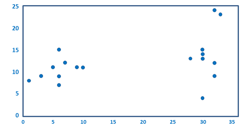
Cluster analysis finds groups of similar respondents, where respondents are considered to be similar if there are relatively small differences between their average ratings. As an example, look at the plot below. It is a scatterplot showing data for 18 respondents on two numeric variables. You can hopefully see that the dots fall into two groups. If you used cluster analysis to analyze this data, provided you didn’t do something wrong, it would also identify the same two groups that you can see. These groups are then called clusters.
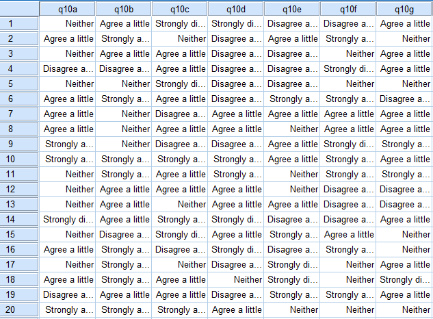
Typically we have many more than two variables and this makes it difficult for us to visualize the data and determine the clusters. It is in such situations that we need to use cluster analysis. Consider the data below, which shows the responses of 20 respondents to 7 variables (this is from SPSS). Can you see a pattern? Perhaps you can find one if you work hard. However, these 20 respondents are from a total sample of 498 respondents and few people could read a table showing all of their data and identify any clusters, which is why cluster analysis (or, better yet, Latent Class Analysis) is used to find clusters in the data. SurveyAnalysis.org has a detailed discussion of how cluster analysis works.
Example
This example analyzes the data that was previewed at the end of the previous section. You can download the SPSS data file and questionnaire if you wish to replicate the example. The data contains seven variables measuring attitudes towards mobile phones, where respondents were asked to give their degree of agreement/disagreement with the following statements:
- Technology is fascinating
- I am often surprised by the size of bills
- I find it difficult to determine best deal
- I spent a lot of time shopping for best deal
- I closely monitor the time I spend on the phone
- Cost is a factor when deciding where to SMS or phone
- I try to keep calls short and to the point
The scale used was:
Strongly agree
Agree a little
Neither
Disagree a little
Strongly disagree
DON’T KNOW
Consequently, prior to analyzing the data the data needed to be prepared in two ways:
- People that said DON'T KNOW were assigned missing value codes in the corresponding variables.
- The data was recoded so that a value of 1 was assigned to Strongly disagree, 2 to Disagree a little and so on up to 5. Note that these precise values are arbitrary as there is no good reason why these categories should be assigned values from 1 to 5 with a space of 1 between each scale point. While arbitrary, this is, nevertheless, standard practice.
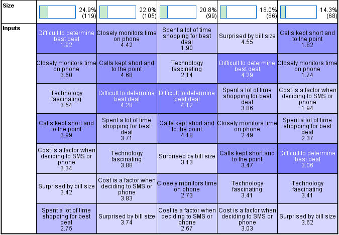
SPSS’s Two Step Cluster analysis routine, which is the best of the cluster analysis techniques that is available in SPSS,[note 1] recommends the following five cluster solution.
The top row of the table shows the sizes of the clusters. We can see that approximately 25% of the sample is in the first cluster, 22% in the second and so on.
The variables are then listed underneath each cluster in the order of their importance in determining cluster membership. Looking at cluster 1 we can see that the variable shown at the top is Difficult to determine best deal. As its average value is 1.92 and, as a 2 represents Disagree a little we can conclude that people in cluster 1 find it relatively easy to identify the best deal. Looking elsewhere in the table we can see that all the other clusters found it hard to find the best deal (i.e., as their averages are much higher than 1.92). Similarly, if we look at cluster 2 we can see that the most important determinant of membership of this cluster was level of agreement with the statement Closely monitors time on phone.
In a real-world study the basic process from this point would be to:
- Create a summary of the unique aspects of each of the clusters.
- Run crosstabs of the clusters against other interesting tables to see if there are any further interesting relationships.
- Examine alternative cluster analysis solutions. Generally it is useful to explore solutions with fewer clusters than those that are automatically suggested. In this case, a five cluster solution was automatically identified so it would be advisable to also review solutions with four, three and two clusters. (Note that there is no truly scientific method for determining the number of clusters and that all automated methods for selecting the number of clusters really do is identify the maximum number that is likely to be sensible.)
- Come up with evocative names for each of the clusters (e.g., “The big talkers”).
Latent class analysis
Latent class analysis is essentially an improved version of Cluster Analysis. It is used for the same types of things as is cluster analysis. In survey analysis, this mainly involves finding segments. Latent class analysis improves on cluster analysis in two important ways:
- It is able to handle many different types of data (e.g., rankings, ratings, Choice Modeling).
- It automatically addresses Missing Values.
Example
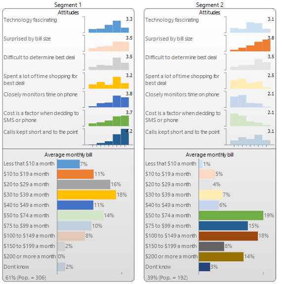
The output below has been created by Q (and is almost identical to that created by Displayr). Seven variables from the Mobiles study have been used in the analysis: six are numeric variables measuring attitudes (see Cluster Analysis for a discussion of this data), and the seventh is a categorical variable measuring the average monthly bill. Q has automatically identified two segments. The first segment contains 60% of the market and they are people with relatively lower average bills whose attitudes reveal that they are relatively cost focused. The second segment predominantly contains people with higher monthly spends who are less concerned with price but are more likely to be surprised by their bill size.
Selection of the number of segments
A trade-off needs to be made when selecting the number of segments. The more segments one has, the greater the extent to which the analysis reflects the diversity observed in the data. This suggests that having a large number of segments is desirable. However, the more segments one has, the greater the risk that the diversity that is identified is meaningless diversity. The risk is that the segments end up reflecting the properties of the specific data used in the analysis rather than the true diversity in the world at large. This suggests it is preferable to have fewer segments.
Various heuristics have been developed that attempt to find sweet spot in this trade-off. The most widely used is the Bayesian Information Criterion (BIC), which computes a value for each possible number of segments and recommends that the best segmentation is the one with the lowest BIC. It should be kept in mind that heuristics such as this are just rules of thumb, and it is not appropriate to assume that the number of segments identified by the BIC is in any sense optimal. While caution should be exercised if choosing a greater number of segments than suggested by the BIC, there is often good reason to select a smaller number of segments, as this is often more practical in terms of implementing the segmentation.
Perceptual mapping
Perceptual maps are charts that show the the relationships between different categories in a survey. For example, the map below shows how different brands of cola are perceived. Most perceptual maps used in survey analysis are created using Correspondence Analysis. The example below was created in Displayr.
Sometimes it is useful to understand how if there are correlations between large numbers of variables. For example, this can be useful to:
- Understand how attitudes and/or behaviors are interrelated.
- Identify redundant questions in a questionnaire if there is a need to simplify it.
- Identify redundant concepts in form of a concept test.
- Summarize data.
- Transform data prior to the application of other multivariate techniques (e.g., Cluster Analysis and Regression).
The identification of correlated variables is generally done using Principal Components Analysis, but most of the time when researchers conduct principal components analysis they refer to it as factor analysis (which is technically a different technique, but the differences are trivial).
Principal components analysis identifies variables that are highly correlated with each other.
Principal Components Analysis
Principal components analysis identifies variables that are highly correlated with each other.
Example
This example analyzes seven variables measuring the extent of agreement with the following statements:
- Technology is fascinating
- I am often surprised by the size of bills
- I find it difficult to determine best deal
- I spent a lot of time shopping for best deal
- I closely monitor the time I spend on the phone
- Cost is a factor when deciding where to SMS or phone
- I try to keep calls kept short and to the point
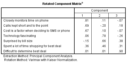
The key output of principal components analysis is the rotated component matrix, such as the one shown below (computed using SPSS). The seven variables that have been analyzed can be reduced to three variables. The seven original variables are shown in the rows and the three new variables are represented by the columns and are referred to as components. The numbers in the table are correlations but when conducting principal components analysis they are typically referred to as loadings.
This output is interpreted as follows:
- The first component is highly correlated with Closely monitors time on phone and reasonably strongly correlated with Calls kept short and to the point and Cost is a factor when deciding to SMS or phone. Thus, this first component seems to relate to reflect a cost sensitivity dimension (that is, it suggests that a key distinction between people is how concerned they are about price).
- The second dimension is a bit more difficult to interpret . There are relatively high loadings for fascination with technology and being surprised by bill size. Why these two variables would be correlated is difficult to explain and is perhaps more of a weird fluke than a profound insight (not that because these two variables are both correlated with the second component this implies that they are also correlated with each other).
- The third component essentially only reflects agreement with the idea that it is difficult to determine the best deal.
- The variable Spent a lot of time shopping or the best deal is not highly correlated with any of the components and thus is largely ignored.
The real conclusion to draw from this analysis is that the principal components analysis has failed to identify much that is interesting. Perhaps a more interesting solution could be found by investigating more components (e.g., four or five), but it is unlikely that this would be so useful as having, say, a five component solution instead of the original seven variables is not much in the way of a simplification of the data.
Software
Almost all applications of principal components analysis in survey analysis employ a varimax rotation.
| Product | How to do it |
|---|---|
| Q |
|
| SPSS |
|


